27.12.08

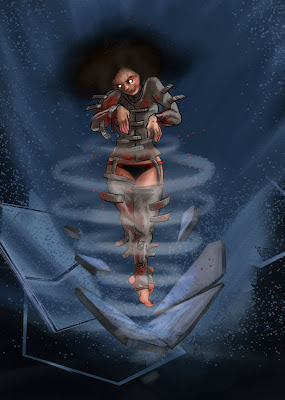
Psycho Girl


Yeah so it's been a long time since I posted so here's something I'm working on... for a Zbrush contest I know I can't win because I don't own a license! Might as well enter though. The contest is about making a superhero or villain. I opted for villain, and call her "Psycho Girl"!

Cue Drum and Bass:

Psycho Girl

After being physically and mentally abused by her parents and teachers, Lily Greene retreated into her own mind and hasn't come back since. In her place was a cold and ruthless killer-- a powerful psychopath capable of killing with a smile. She was found mutilating her parents dog with her bare hands and teeth and was quickly committed to Bedlam Asylum. Her latent psychic abilities began emerging after undergoing intensive shock therapy. At first, it was exhibited by causing other mental patients severe migraines. Those housed closest to the young villainess eventually died by having severe aneurysms. With every shock therapy session, her powers grew-- until one day she found she could emit electromagnetic waves in short blasts, simultaneously destroying her strait jacket's bindings and almost every physical structure around her. She walked out of the asylum, destroying everything, and everyone in her path. She is a loose cannon and needs to be stopped!

Powers:
Short Electromagnetic bursts, with which she can propel objects, people and herself into the air for a short time. Can act as a form of telekinesis, a shield and an electric cannon.

Weaknesses:
Doesn't stand up well against forcefields, invisibility... or anything that might trigger a headache. Though she's very powerful, she gets tired very quickly and has the physical vulnerability of a normal human.

5.6.08

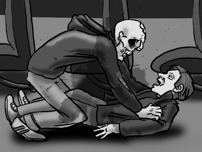
Going my way?


"Going my way?"
Completion Time: 2 hours.

Also made a desktop background for fans of the undead hitchiker:


In other news... the move to London is happening! Also the website and new portfolio are FINALLY done, the most major part of which was my storyboarding a section of "Mind the Gap" (a short film by Simon A. Brown that hasn't been made yet.) Old scripts = good practice.

So check out my website at www.fractalbot.com!

22.5.08

Speedy Ship


"The Syrinx"
Ok... kind of speedpainting at 2 hours...
... but still faster than usual. So some improvement there.

Made for Conceptart.org's Deep contest, under the Industrial design topic.

Named the Syrinx after the extremely large but delicate shell. The ship moves slowly in deep water, travelling in some of the earth's deepest natural trenches. The expansive viewing dome provides an excellent viewing space to some of the world's strangest creatures: the trandsparent but deadly deep sea life.

21.5.08

space armour

Some space armour thumbnail sketches... approx. 1 hour

Nothing new here except I'm beginning a new self-imposed storyboarding project. And there's nothing I hate more than composing my own shotslists! More on that later...

Would also love to refer you to an excellent website I found earlier... Idrawgirls.com. Great FREE video tutorials and lots of great art/forum stuff. Check it out.

19.5.08

When doodling in class is good.


Portrait Class No. 1
Time: 40 minutes

Right, so this is my first go at live digital painting. Basically, I got so bored in this portrait class I'm taking (for the mere three weeks I'm in Tallahassee) that I abandoned the sketchbook for the laptop. Goodbye sketchbook! I loved you.... ah, fuck it. I like the results of this.

One thing I have learned in drawing class though, through worrying about the process rather than the result is that I have several trends when it comes to drawing the figure.
- Small heads,
-Over musculature
-eyes too big, ears not far back enough.

When did this develop? How did I not notice? Probably from drawing from memory so long I forgot what a real person looked like.

These sketches I did later on, after class and are from memory... but they did take longer than my usual sweeping-around-until-it-looks-kinda-right sketches. Also am working on creating more dynamic figures, studying anatomy, etc.


18.5.08

I drew Conan out of Guilt.


Roman Conan:
the object of my brother's beggary.
Time: 2 hours.

That's right. I got guilted into drawing Conan the Barbarian. The Roman version. Even worse, it's for my brother's guild website banner. I think I need to go to bed now.


The two final banner compositions. There are others, these are the best.
The Guild's name is Guiltless, ironically.


16.5.08

Deep Creatures!


Rock Angler
Conceptart.org Creature of the Week
("Deep" Week 1)
Time : 2.5 hours

(So it took a bit longer than I expected but that was for the repaint.)


Creature Profile:

When born, it's skin is rich in calcium to promote fast-growing coral to cover the entire length of the Angler's body. With this natural protection it crawls unseen amongst coral reefs (which I imagine are premier property for our water-dwellers due to its beauty and colourful inhabitants).

Originally eating fish carcasses and acting as a cleaner species for the reef environment, the Rock Angler now chooses to eat the wastes discarded from the biodomes, especially protein rich vegetable matter and leftover fish parts. Frequently seen as a useful species they are allowed to climb on walls and go unharmed near the submerged habitations.


I'm very excited that conceptart.org is running a huge competition for 6 weeks called "Deep"!!!! Lots of prizes, lots of things to work out. For the competition we're pitted against each other to come up with the coolest ideas for an undersea human society-- the creatures and people we interact with in a submerged environment. Very exciting. Week 1 creature could be anything and we're allowed more than one entry... so here's my first sketch on Day 1 of Deep.

Look forward to seeing what all the forum badasses will do for this. My painting definitely isn't there yet, but I'm feeling more confident. (I guess this would be painting no. 8 or 9? But the sluagh one set me back... that one doesn't count, don't look at it!) .

More to come.

14.5.08

The Antimuddy Brush

After much deliberation and research, I've created what I hope to title the "Antimuddy Brush". Because the muddying blenders were driving me mad, I did a bit of poking around with the brush settings and found that some brushes (preferably opaque and flat brushes with no strokes)
are perfect for adjustment and use as blenders themselves... with the addition of colour and transparency. To modify them this way, enable the brush to Load multiple colours:

To paint with multiple colours

1
Choose a brush.
2
On the Stroke Designer page of the Brush Creator, click General.
3
Choose Static Bristle from the Dab Type pop-up menu.
4
Choose Multi from the Stroke Type pop-up menu.
5
On the Stroke Designer page, click Well, and enable the Brush Loading check box.

This step activates the brush’s ability to pick up underlying colors.
6
Adjust the Resaturation and Bleed sliders.

The Bleed setting determines how much underlying paint is affected by the brush stroke. A higher Bleed setting, combined with a low Resaturation setting, can enhance the Brush Loading feature. A resaturation value of 0, combined with different levels of bleed, will cause your brush to smear image colour, rather than deposit it. In this case, the lower the bleed, the longer the smear.
7
On the Stroke Designer page, click Spacing, and adjust the Spacing and Min Spacing sliders to create fewer “echo” artefacts in your smeared stroke.
8
Drag a brush stroke through existing paint to see how the paint is “picked up” from the underlying pixels and moved across the canvas.


Ok! as you can see... if you play with it you can get some good results! Lately I've been combining this with the power of the Add Water blender to get some nice, un-muddied results:

(I know the handwriting is atrocious... bear with me... )

My Gouache Anti-Muddy Brush:

Sample 1: Straight three colours, blended with Add Water in vertical strokes. Crap, right?

S. 2: same three colours, with dashes of white to space the colours slightly. Blended w/ a. w. Notice slight desaturation from white. (the reason for trying this goes back to my traditional methods of blending acrylics.

S. 3: Voila! Antimuddied results. Same three colours again, only muddled slightly by dashing the antimuddier and breaking up the two main divisions between the three. The antimuddier always was the lighter of the colours, and the brush strokes kept consistently short to allow for greater variation. Further blended with Add Water.

N. B.... Sample 3 was much easier to blend than the other two, and as you can see resulted in a more varied and realistic colour gradient. Not to mention smoother!


Also have been keeping my eye on the recent discovery that Corel softens pieces once they are saved, allowing me to worry a bit less about my smooth strokes and blending nonsense.

I realized that the Sluagh sketches look much better than the final, and took about 1/5 the amount of time-- because I was using the damn blender! So here we go, new tool for the workflow.... let's hope this one helps.

12.5.08

Cycleclops


Daily Sketch Group: "Monopedal Cyclops"
Time: 2 hours.
So it's a stupid topic.... I'm getting faster! I find the trick is hardly using the blender, painting quickly with ready-made swatch pallettes (used skin tones for this one) and working with pencil and airbrush to sub for blenders. Faster, and better results. : D
Also am considering getting some Carlos Huante DVDs... so maybe in ten years I can be at that level.

11.5.08

Final Sluagh!

Conceptart.org weekly competition
Time it took: too freaking long.
I think the hilarious part is that I actually like the sketches much better than the final. Blenders! What the fuck! Maybe I should just stick with my bleedin' photoshop, as I get much better results.... the problem now is that I've become hell-bent on mastering corel. Argh.
Have also started taking a figure drawing class and will post some drawings from that soon. : p

6.5.08

Weekly Contest: Sluagh Creature


Sketches 1-4 for ConceptArt.org Weekly contest:
"Sluagh"

In Irish and Scottish folklore, the Sluagh (Irish /sɫuə/; Scottish Gaelic /sɫuaɣ/) were the spirits of the restless dead. Sometimes they were seen as sinners, or generally evil people who were welcome in neither heaven nor hell, nor in the Pagan Otherworld, who had also been rejected by the Pagan deities and the earth itself. Whichever the underlying belief, they are almost always depicted as troublesome and destructive. They were seen to fly in groups like flocks of birds, coming from the west, and were known to try to enter the house of a dying person in an effort to carry the soul away with them. West-facing windows were sometimes kept closed to keep them out. Some consider the Sluagh to also carry with them the souls of innocent people who were kidnapped by these destructive spirits. The Sluagh are considered by some to be an Irish manifestation of the Wild Hunt.


Weekly contest: draw a member of the Sluagh and a variation.

So these were a few done in a few hours... I progressed from something fluid and graceful to something a bit more gangly, with each one becoming increasingly insect-like.... probably reflects my fear of insects. Or my admiration for H R Giger's alien designs with a touch of Francis Bacon.

Either way the sketches tended to get messier and more frightening... I think my favourites so far are no. 2-3, and they also clearly carry on the insect-demon theme so they're clearly variations.

Anyway, I'll post these and see what comments I get!

(More sketches to come!)

5.5.08

Fetal Mistake


Fetal Mistake
(they forgot the head!)

Concept Art Daily Sketch Group Entry
Time: 2.5 hours

This is a photoshop painting, and blurry to make it seem as though you're looking through water into a fetal formation tank. The contest was to create a prenatal synthetic creature, so I chose to create a concept that had plug-in head. The head could be inserted and removed, to either swap bodies or to reconcile loss in case the body was damaged.

2.5.08

Quickie!


Quickie!
Time: 20 min.

(a quickie for some, but not others...)

Don't want to get repetitive here but am exploring different painting techniques. Anti-muddying tactics.

For this one I started out with a b/w speed sketch, which honestly was shite, and then instead of painting directly on that and blending my neutrals in I painted the colour using the digital airbrush on a colourized layer over top. Then dropped it when I was satisfied. After that I touched up and carefully blended, much less than usual.

Bleh. Painting. I'm almost ready to dig into some boards at this point!

1.5.08

Corel Painting No. 2: Special Interspecial


Corel Painting No. 2: Vulturaffe
(entry for Conceptart.org contest)
Time to competrion: approx 3-4 hours, not consecutive.
And while watching TV which I find distracting.

Okay, here we go, Corel Painting No. 2!!! Already I'm much improved in timing and muddying, which is very encouraging for me. I'm feeling the 10 paintings are troublesome, but much needed. Also am in the beginning of my month of portfolio, and in the process of moving (and trying to get rid of my scrapped Saturn). Nothing but drawing for me!

This piece was an interesting one. I recently joined conceptart. org, and amazing forum for pros and entry-level pros like myself. One of the best things about the website is that they set up weekly competitions with different subjects. This one is the first I've entered, and was to create a creature by blending two unrelated species together. Obviously I made a pretty ugly Vulture-giraffe combo. The original sketch was turning out way too cute though so I tried to make it a bit stranger...


Yep... way too cute. Like a happy four-legged ostrich. I was definitely pleased with the final outcome of the contest though, and plan to do one a week for a few months while brushing up on my drawing. That should get me ready for London!


25.4.08

The Corel adventure begins.

Corel Painting No. 1: Martian Battle
Scene from pulp novel "A Princess of Mars"
by Edgar R. Burroughs
(author of Tarzan)

Time to Completion: A million years.

By the time I finished this work I was convinced I was actually on Mars. Because humans had evolved into space capsules and had teleported themselves there using mind control.

That's how long this took to look somewhat... um.... decent....


(detail)

So this is Painting no. 1 in my May Paint-a-thon! The final brush-up (boom-boom) before I head off to London. Towards the end of the painting I was already getting faster about selecting and using the 9 million brush sets, and I think the biggest pain was mainly in finding which ones worked for me and which ones didn't. I still love photoshop, though, not because in compares in scope but for its simplicity and expansive brush tweaking. (Not to mention easy to pirate brush sets! : D )

So to recap we have:
Muddying, check
Long completion, check
Computer tan, check.

May will be interesting because I'm going to be spending it just working on my portfolio. No restaurants, night shifts, student parties, Wii or etc. etc. etc. Just drawing. And packing the one box I'm allowing myself to move-- which will probably just have my monitor and shoes in it.

On the upside, I'll fit right in in England because of the computer tan!

12.4.08

Video Up... Finally!


Speedpainting regime No 1: Space ship. Time: 45 minutes.


Two things... first, I am undertaking a SPEEDPAINTING REGIME. Basically, where I don't see the sunlight until I improve my photoshop articulation. Second, I have finished the Zombiematic at last! You can see it here:


http://fractalbot.com/videos/zombie1.html.


Also just wanted to say that after many days of using the program Corel Painter X, I have experienced nothing but difficulty. Is the learning curve a bit high on this program? (this coming from someone who works with Maya... ) At first I was impressed by the millions of tools available but after trying to do some painting with it got quickly overwhelmed! It seems that the painting app is so realistic, it actually muddies your colours... just like in real life. Though that aspect was one I hoped Corel wouldn't emulate.

Ah well. As my high school art teacher once said, if you want to learn how to paint, sit down and do 10 paintings and then you're ready to learn. I think my disgust is founded in the fact that in Corel my work looks like it's reverted to what I was doing two years ago, with no wacom tablet, and without the right glasses prescription.

So ten Corel Paintings? We'll see how it goes.

5.3.08

Cloverspray

This is my entry for the Bristol Animation School storyboard competition. The guidelines were as follows:
- 20 frame or less
- Concept is as important as drawings
- Must be an advert about insectiside.

n.b. "Insectiside" is not pronounced "incestiside"....


Da-da-daaaaaah.....
"Cloverspray: A Roach's worst nightmare."

I opted not to use this tagline:
Nothing breaks up a roach party like a little genocide! : )

4.3.08

Zombie Girl Designs

A character from a graphic novel I'm thinking about... which makes the undead much more than Romero's lobotomized rotting flesh.


(final composition)

12.2.08

"Welcome to London" ... the ZOMBIE-matic!


For my first post, I'd like to introduce a personal portfolio project that I'm working on right now: a Zombie-matic!

No, it doesn't make zombies if you flip the switch.

This is basically an animatic about a tourist that gets on the wrong nightbus...
called "Welcome to London".